A Guide to Formatting LinkedIn Posts
Published on 2025-10-14
Formatting a LinkedIn post is more than just typing out your thoughts. It’s about making your content pop, making it easy on the eyes, and most importantly, making people stop scrolling. It’s the smart use of short paragraphs, white space, bold text, and even emojis that grabs attention and pulls people in. A post that’s formatted well ensures your main points don't get lost in the noise of a busy feed.
Why Post Formatting Is Your Secret Weapon on LinkedIn
Ever scroll through your LinkedIn feed and wonder why some posts just leap off the screen while others are dead on arrival? It's rarely just about the message. It's about the delivery.
Imagine picking up a book with no chapters, no paragraph breaks, and tiny font. No matter how brilliant the story is, you'd probably put it right back down. LinkedIn works the same way. A huge block of text feels like a chore to read.
But a post broken up with plenty of white space, bolded keywords, and maybe a few bullet points? That feels inviting. It’s scannable, which is everything for today’s fast-moving audience, especially those scrolling on their phones. They can get the gist in seconds.
The Power of Readability
Let’s be real: if your content is a pain to read, people won't read it. Simple as that. Good formatting isn’t just about looking pretty; it’s a direct driver of your post's performance.
Here’s what a well-structured post can do for you:
- Stop the Scroll: Those visual breaks are like speed bumps for the thumb, catching the eye and breaking the scrolling trance.
- Boost Engagement: When your message is clear and effortless to absorb, you'll see more likes, comments, and shares.
- Signal Professionalism: It shows you put thought into the reader's experience. That small effort instantly builds your credibility.
Your goal isn't just to share information; it's to create an experience for your reader. Smart formatting transforms a basic text update into a piece of content that demands attention and starts conversations.
Ultimately, how you present your ideas is a fundamental part of communicating effectively on LinkedIn. If you're a job seeker looking to stand out, combining strong writing with sharp formatting is a must. For some inspiration, you can explore these ChatGPT prompt ideas for job seekers on LinkedIn to help generate compelling content.
By marrying great ideas with a thoughtful presentation, you make sure your posts don’t just get published—they get seen. For a deeper look at all the elements that make a post successful, check out our complete guide here: https://autoghostwriter.com/blog/linkedin-post-best-practices
Mastering White Space for Readability and Impact
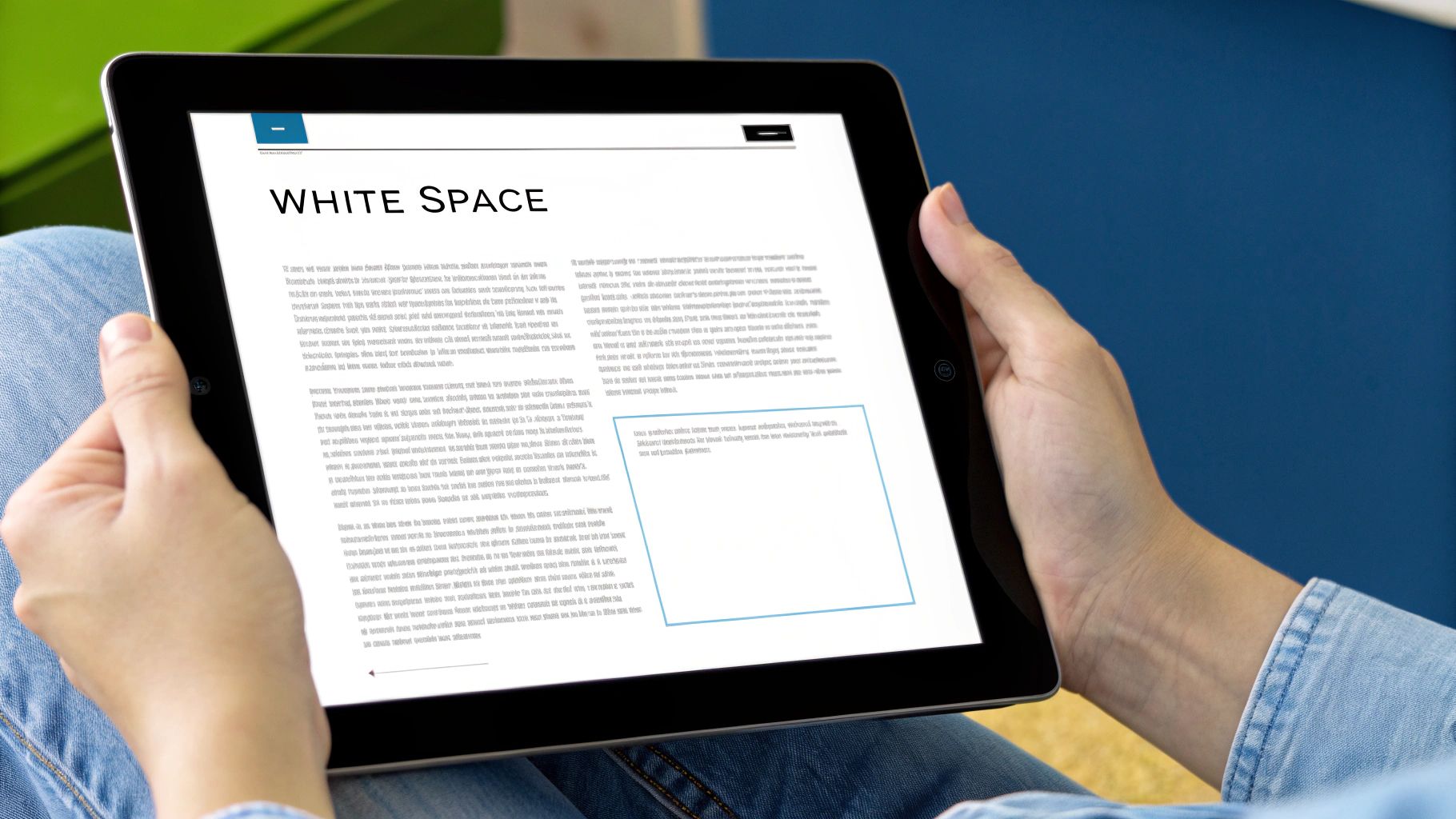
The single most powerful tool for formatting a great LinkedIn post is completely invisible. It's white space. This is the empty canvas that makes your words pop, and it’s what separates an amateur post from a professional one.
Long, dense paragraphs are instant scroll-killers, especially when you consider that over 57% of LinkedIn engagement happens on a mobile phone. You have to write for the thumb-scroller.
Think of each line break as a pause for breath. It gives your reader a split second to digest one idea before you hit them with the next. This is how you create a rhythm that pulls people down the page.
I’ll often use a single sentence on its own line just to add a bit of drama or to make a key point impossible to miss. It’s a simple trick, but it works wonders for building momentum.
Creating a Scannable Flow
Your main goal here is to make your content feel easy to read. You want someone to glance at it and think, "I can get through this quickly." The best way to do that is by grouping your ideas into small, digestible chunks.
Separate these little thought-nuggets with a double line break. This creates a clean, visual separation that guides the eye.
Let's look at a real-world example. You wouldn't want to post a dense block of text like this:
Before:
"Last quarter, our team achieved a major milestone by increasing engagement by 25% after we implemented a new content strategy, which focused on customer stories and educational videos. We couldn’t have done it without the entire team's support and dedication, and we're so grateful for everyone’s hard work on this journey."
Instead, you break it up with purpose:
After:
"Big news from our team! 🎉
We achieved a 25% increase in engagement last quarter.
How? By shifting our content strategy to focus on what matters: your stories.
We couldn't have done it without the team's incredible support.
Thank you for being part of this journey! 🙏"
The "after" version is not just easier to read; it’s more impactful. The white space isolates each point, giving it more weight and ensuring your key metrics and messages land with absolute clarity.
This deliberate use of space transforms a wall of text into a structured, persuasive message. It shows you respect your reader's time and, in return, they're far more likely to engage with what you have to say.
Using Bold Text and Emojis Like a Pro
Beyond basic spacing, bold text and emojis are your secret weapons for making a post pop. But there's a fine line between eye-catching and obnoxious. Used well, they pull your reader’s focus right where you want it. Used poorly, your post can look unprofessional or, even worse, like spam.
How to Add Bold Text (Without Overdoing It)
LinkedIn doesn’t give you a built-in "bold" button for posts, but there’s an easy workaround. I just use a free online Unicode text converter. You type in the phrase you want to emphasize, copy the stylized text, and paste it directly into your LinkedIn draft.
The real skill isn’t how you do it, but when. Think of bold text as your highlighter. It’s perfect for making a critical number, a key takeaway, or a short, punchy phrase impossible to ignore. It’s not meant for entire sentences.
A quick heads-up on accessibility: Over-the-top fonts from these converters can be a nightmare for screen readers. If you stick to the standard bold options, you’ll ensure your content is accessible to everyone.
Adding Personality with Purposeful Emojis
Emojis are more than just cute decorations; they're functional visual cues. When used with purpose, they add a splash of personality and guide the reader through your content. They can break up text, signal your tone, and draw attention to the most important parts of your post.
Here’s my simple framework for using them effectively:
- As list markers: Ditch the boring old bullets. Try using checkmarks ✅, arrows ➡️, or stars ⭐ to make your lists more dynamic and scannable.
- To set the tone: A single emoji can do the work of a whole sentence. A 🧠 can signal a deep thought, while a 🚀 is perfect for celebrating a big win.
- To guide the eye: An emoji at the very start of your hook or right next to your call-to-action acts like a magnet for your reader's eyes.
For instance, instead of a dry list of accomplishments, you could frame them this way:
🏆 Smashed our Q3 sales record
📈 Boosted user engagement by 25%
🤝 Welcomed 10 new strategic partners
See the difference? It's visually interesting without feeling cluttered. The goal is always to make your post easier to read and more memorable. A few well-placed emojis can make all the difference.
Formatting Posts With Images and Carousels
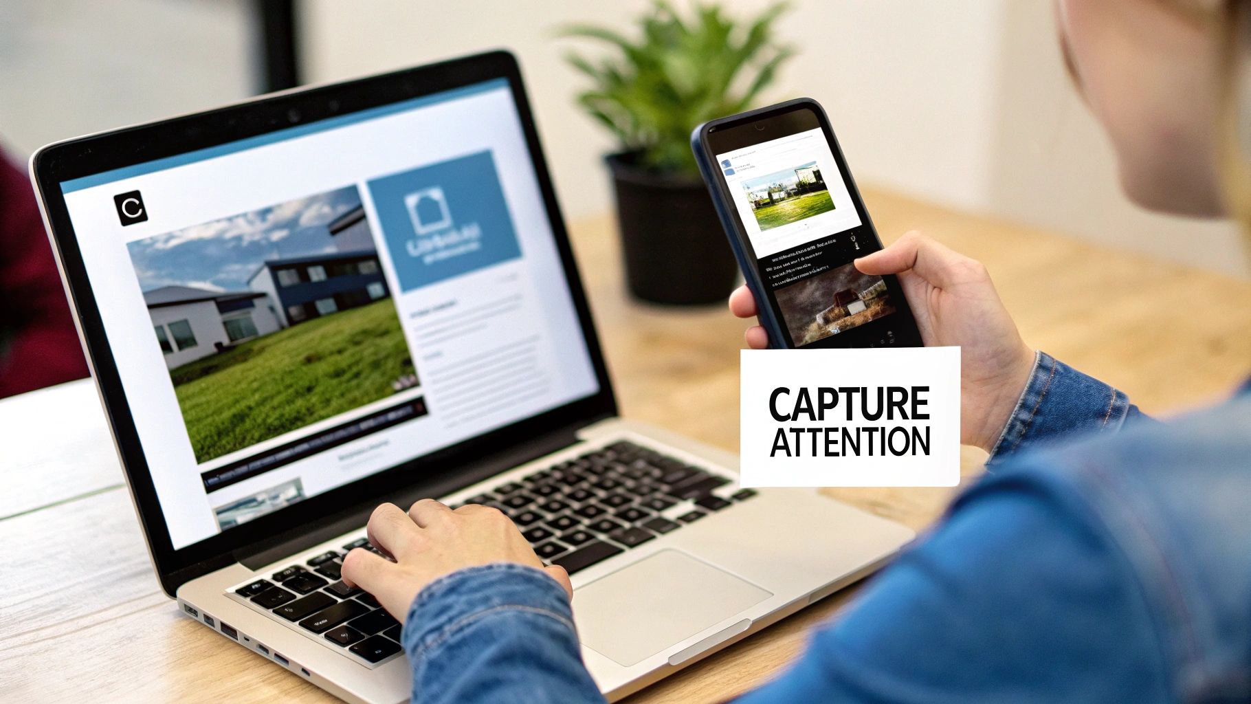
Visuals are what stop the scroll, but it's your words that make people actually care.
When you add an image or video to a LinkedIn post, the platform only gives you a couple of lines of text before hiding the rest behind that dreaded "see more" link. This makes your opening hook absolutely non-negotiable.
Think of it as the headline for your visual. Your mission in those first two lines is to spark enough curiosity that someone just has to click to get the full story. A vague opener will get you nowhere—you need a punchy statement or a compelling question that promises a payoff.
Structuring High-Engagement Visual Posts
Beyond just a single image, certain visual formats are engagement powerhouses on LinkedIn. It’s no secret that carousel posts and document attachments consistently rank among the top performers for company pages.
In fact, according to research from SocialMediaToday, video content drives 1.4 times more engagement than other formats, which really underscores how powerful a mixed-media strategy can be.
Carousels are especially effective for walking your audience through a story or a series of tips. Each slide is a new chapter, a new chance to deliver a key insight.
This infographic breaks down the core elements of a visual post that works.
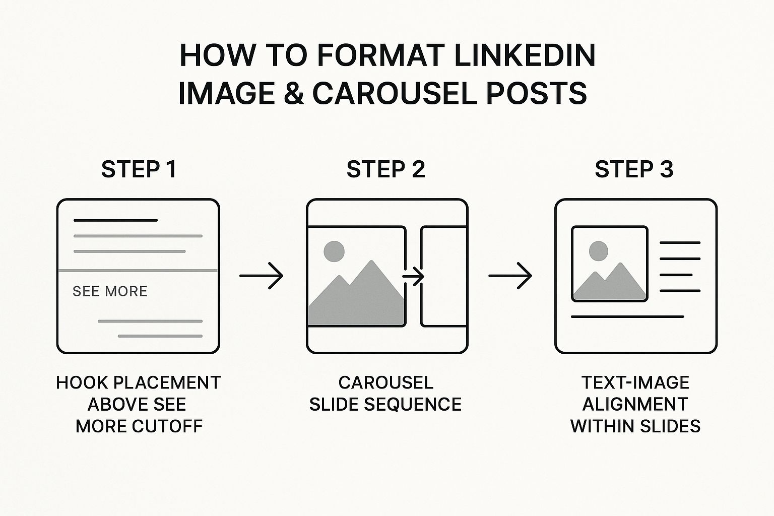
As you can see, it all starts with that powerful hook. From there, you build a logical narrative slide by slide, making sure the text and images work together to deliver a clear message.
The most successful visual posts treat text and images as equal partners. The image grabs the eye, but well-formatted text tells the story, adds context, and gets the conversation started.
When building a carousel, the text on each slide needs to be minimal but mighty. I've found this simple formula works wonders:
- Slide 1: Start with a bold headline that nails the problem or topic.
- Slides 2-5: Dedicate each slide to one key idea or tip. Use a big, clean font and plenty of white space. Don't crowd it.
- Final Slide: End with a clear call-to-action. Ask a question, invite comments, or point them to a resource.
This approach transforms a simple share into a mini-presentation that keeps your audience swiping.
For a deeper dive, check out our complete guide on how to create an effective LinkedIn carousel post.
Quick Guide to LinkedIn Image Dimensions
Getting your image dimensions right is a small detail that makes a huge difference. The right size prevents awkward cropping and ensures your visuals look sharp and professional on any device. Here's a quick cheat sheet to keep handy.
| Post Type | Recommended Dimensions (Pixels) | Best For |
|---|---|---|
| Single Image Post | 1200 x 1200 (Square) | Maximum visibility in the feed, great for infographics and quotes. |
| 1080 x 1350 (Portrait) | Takes up more vertical screen space on mobile, ideal for photos. | |
| Carousel Post | 1080 x 1080 (Square) | Consistent, clean look for multi-slide educational content. |
| 1080 x 1350 (Portrait) | Creates an immersive, full-screen experience as users swipe. | |
| Article Header | 1920 x 1080 | Professional, high-resolution banner for long-form content. |
| Video Post | 1920 x 1080 (16:9) | Standard landscape format for most video content. |
| 1080 x 1920 (9:16) | Vertical video, perfect for mobile-first, informal updates. |
Keep this table in your back pocket, and you'll never have to guess about image sizes again. It’s a simple way to guarantee your content always looks its best.
Placing Hashtags for Reach Without Clutter

Hashtags are essential for getting your post in front of a wider audience, but nothing kills the vibe of a great post faster than a clunky block of tags at the end. The secret isn't stuffing your post with every tag you can think of; it's about being strategic.
After years of testing, I've found the sweet spot is just 3-5 highly relevant hashtags. This approach keeps your content looking clean and professional while still giving you the discovery boost you need. Any more than that, and you risk looking spammy, which can turn readers off.
Where you place them matters, too. Always put your hashtags at the very end of your post. After you’ve written your last sentence, hit enter two or three times to create some clean white space. This little trick separates the tags from your main message, letting them do their job in the background without distracting your reader.
Building Your Hashtag Mix
A powerful hashtag strategy is all about balance. You want to create a mix that helps you reach both a broad audience and the specific people in your niche.
Here’s the simple formula I always come back to:
- 1-2 Broad Tags: These are the high-traffic keywords for your industry, like
#Marketingor#Leadership. - 1-2 Niche Tags: Get more specific here. Think
#ContentStrategyTipsor#B2BSaaS. - 1 Branded Tag: This should be unique to you or your company, like
#AutoGhostwriterAI.
This combination ensures you're part of the big conversations while still carving out your own space. With median engagement rates on LinkedIn hitting an impressive 8.01% in early 2025, a smart hashtag strategy is a non-negotiable part of the game. If you're curious about the numbers, Buffer.com has some great data on LinkedIn's impressive engagement metrics.
Treat your hashtags like a final, subtle signature—not the main event. This keeps your post looking polished while quietly boosting its reach.
If you want to go deeper on this, we've put together a complete guide on how to use hashtags on LinkedIn.
Your Top LinkedIn Formatting Questions, Answered
https://www.youtube.com/embed/c09i_MltrLg
Even when you know the rules, you'll inevitably run into a few weird quirks while putting a post together. It happens to everyone. Let's walk through some of the most common formatting headaches so you can get your content live without a struggle.
One of the biggest culprits? Formatting that completely breaks when you copy and paste from Google Docs, Notion, or another app. The fix is surprisingly low-tech: paste your text into a plain text editor first (like Notepad on Windows or TextEdit on Mac). This little step strips out all the hidden background formatting that messes with LinkedIn’s editor, giving you a clean slate.
Can You Overdo It With Formatting?
Oh, absolutely. The entire point of formatting LinkedIn posts is to make your ideas clearer and easier to digest, not to create a visual mess. While bolding, bullets, and emojis are fantastic when used well, going overboard makes your content look unprofessional and, frankly, hard to read.
Here’s a quick gut-check I run through before hitting "Post":
- Bold Text: Am I highlighting a genuinely crucial point, like a key stat or a powerful takeaway? Or did I just bold a random phrase? Be selective.
- Emojis: Is each emoji doing a job—acting as a visual cue or setting a tone? If they’re just there for decoration, you might have too many. A few with a clear purpose is all you need.
- Line Breaks: Have I created enough white space to guide the reader’s eye down the page? Or is there so much space that the post feels fragmented and long? You're looking for a natural rhythm, not a series of disconnected sentences.
Think of formatting like seasoning a good meal. A little bit brings out the best flavors and makes the whole dish more enjoyable. Too much, and you can’t even taste the food. Your message is the main course—don't drown it in formatting.
And don't forget about your visuals. Nailing the right image dimensions is a simple detail that makes a world of difference. A single image post, for example, looks sharpest at 1200 x 627 pixels. On the other hand, a square 1200 x 1200 pixel image often grabs more attention in the feed. Getting these details right is a huge part of looking professional.
If you’re looking for more deep dives into content strategy, the team over at v30.ai's content strategy blog often shares some great insights.