Mastering LinkedIn Post Analytics for Growth
Published on 2025-07-20
If you're just posting on LinkedIn and hoping for the best, you're essentially making yourself invisible. The key to breaking through is understanding LinkedIn post analytics—the practice of digging into the data behind your posts to see what’s actually working. This data tells you who is seeing your content, how they’re engaging with it, and what really grabs their attention.
Why Your LinkedIn Analytics Are a Goldmine

Let's be real: the "post and pray" strategy is dead on arrival. The platform is just too crowded. But this is great news for anyone willing to look at the numbers, because it gives you a massive edge. Analyzing your post performance turns wild guesses into a reliable method for creating content that genuinely connects with people and builds your professional brand.
Getting past simple vanity metrics is the first real step. Instead of just chasing likes, you can start to understand the story your data is telling you about what your audience truly wants to see.
From Boring Data to Your Secret Weapon
Stop thinking of analytics as a chore. Think of it as your secret weapon for growth. Seriously. Every single impression, comment, and repost is a breadcrumb leading you toward better content. These data points tell you what topics people care about, which formats they prefer, and even the best times to post.
For instance, did a post get tons of impressions but almost no clicks or comments? That might mean your hook was great, but the content itself didn't quite hit the mark. On the other hand, a post that racks up a lot of "Insightful" reactions is a clear sign you’re providing real, tangible value to your professional network.
Your LinkedIn analytics are a direct line of feedback. They help you stop creating content for a generic, imaginary audience and start creating it for your audience. It's the difference between shouting into the void and starting a real conversation.
This data-first mindset is incredibly powerful, especially when you consider the sheer amount of activity on LinkedIn. We're talking about over 1.3 million feed updates being viewed every single minute. The platform also has a surprisingly high average engagement rate of 6.50%, which rewards creators who share helpful, relevant material.
Building a System for Success
By regularly checking in on your LinkedIn post analytics, you create a powerful feedback loop. You'll quickly start to spot patterns that can shape your entire content strategy from the ground up.
- Discover Winning Topics: Pinpoint the subjects that consistently spark conversations and shares.
- Optimize Your Formats: Figure out if your audience responds better to carousels, short videos, or simple text posts.
- Refine Your Tone of Voice: Notice which posts earn the most "Insightful" or "Celebrate" reactions? That’s your cue to lean into that style.
This process gives you the confidence to create content based on what you know works, not just what you think might work. If you're ready for a much deeper look into the specifics and want to truly understand why your analytics are such a goldmine, check out a comprehensive guide to LinkedIn Post Analytics.
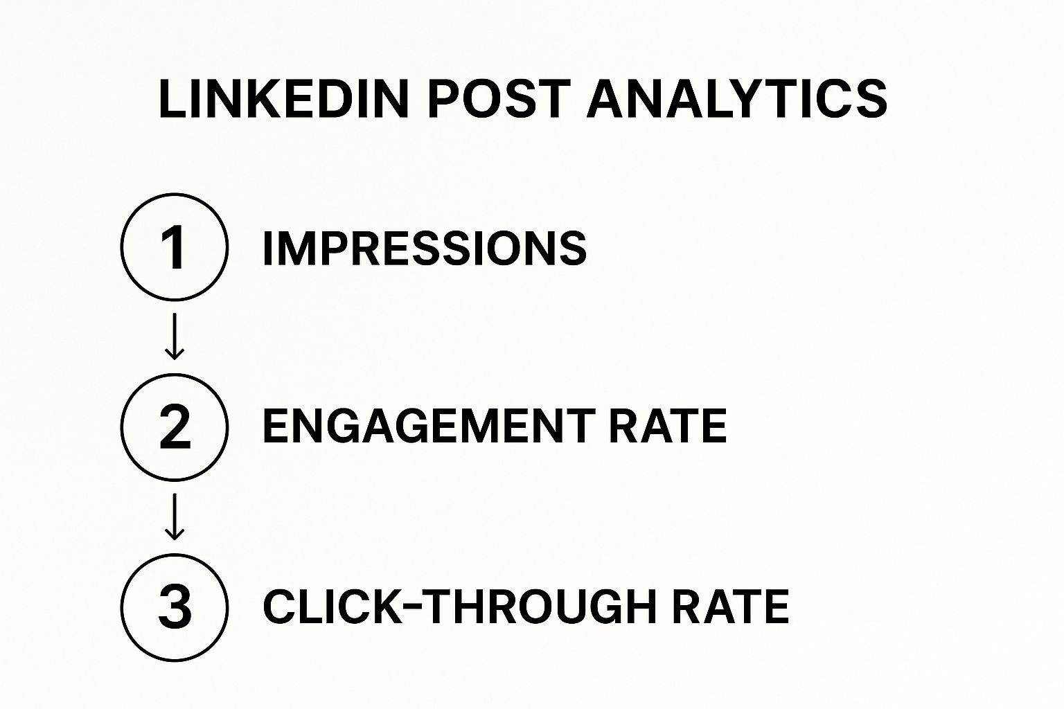
Key LinkedIn Post Metrics and What They Mean
To get you started, let's break down the core metrics you'll find in your analytics dashboard. Understanding these is critical for seeing how your content is performing in the real world.
| Metric | What It Measures | Why It's Important |
|---|---|---|
| Impressions | The total number of times your post was shown to LinkedIn members. | This is your top-of-funnel metric. It shows your content's reach and visibility. |
| Reactions | The number of likes, celebrations, supports, loves, insights, and funnies your post received. | Reactions show immediate emotional response and tell you if your content's tone landed correctly. |
| Comments | The number of direct replies to your post. | Comments are a strong indicator of engagement. They show your content sparked a conversation. |
| Reposts | The number of times other members shared your post with their own networks. | This is a huge vote of confidence. It means your content was so valuable that someone wanted to attach their own name to it. |
| Clicks | The number of clicks on your post, links, or your name/company. | Clicks measure action. They show that your content was compelling enough for someone to want to learn more. |
Once you get comfortable with what these numbers mean, you can move beyond just looking at them and start using them to make smarter decisions about every piece of content you create.
Getting to Your Post Analytics
So, where do you find all this juicy data? You can't turn numbers into a winning strategy if you don't know where to look. Luckily, LinkedIn makes it pretty easy to get to your post analytics, whether you're on a personal profile or a company page. The story of your content's performance is waiting for you, just a couple of clicks away.
Take a look at any post you've shared. Right underneath it, you'll see some gray text showing you how many impressions or views it has. Just click on that number or the "View analytics" button. Boom. A detailed window pops up. This is your command center for that post, showing you exactly who's seen it and what they thought.
Finding Your Post Data
This process is the same whether you're posting as yourself or for your company. As soon as you hit "Post," the data starts trickling in.
To see it, just head to your profile or company page and scroll to the post you're curious about. You'll find the "View analytics" button right there beneath the content. It’s a direct line to understanding what’s landing with your audience in near real-time.
Here’s a look at the analytics panel you’ll see. It’s the first thing that pops up and gives you a quick snapshot.
This initial view is your high-level summary. It gives you the core stats like impressions and reactions, so you get an instant read on how your post is doing right out of the gate.
Digging Into Your Audience Demographics
Okay, this is where the real fun begins. Moving past the surface numbers and into the demographics is where you strike gold. It's how you find out who is actually seeing your content.
Once you’re in the analytics for a specific post, you can see a breakdown of your audience. You'll get insights into their:
- Job Title: Are you connecting with VPs and managers, or is your content mostly seen by entry-level folks?
- Company: Which specific companies are your viewers from?
- Industry: Is your post a hit in the tech world, finance, or somewhere else?
- Location: Where in the world are people seeing your updates?
Let's imagine you run a B2B software company and you're trying to reach marketing managers in the United States. If you check your analytics and see that most of your views are coming from students in India, that's a huge red flag. It tells you loud and clear that your message isn't reaching your ideal customer. Time for a new approach.
My go-to tip: I make it a habit to check the demographics of my best-performing posts every single week. It helps me build a crystal-clear picture of my most engaged audience. Then, I can double down on creating content that speaks directly to them.
Of course, getting your timing right can make a huge difference in who sees your post in the first place. For a deeper dive on that, check out our guide on the best days to post on LinkedIn. When you nail both the "who" and the "when," you've got a serious advantage.
Turning Engagement Metrics Into Actionable Insights
So, you've posted on LinkedIn, and the numbers are rolling in. It's easy to get a little thrill from seeing high impression counts, but let's be real—impressions alone don't pay the bills. A post can flash in front of thousands of people and still do absolutely nothing for your actual goals.
This is where we go from just reading the metrics to truly understanding what they’re trying to tell us.

The real magic happens when you see how the numbers relate to each other. For example, have you ever had a post with tons of impressions but almost no reactions, comments, or clicks? That’s a classic sign of a mismatch. Your hook or first sentence was good enough to stop the scroll, but the rest of the post didn't deliver on that initial spark.
That mismatch is your first big clue. It’s a signal to look closer at what you wrote. Was the advice too generic? Was your call-to-action buried or confusing? Figuring this out is the first step to creating content that doesn't just get seen but actually connects with people.
What Reactions and Comments Are Really Saying
Not all engagement is created equal. The type of reaction you get offers a powerful peek into how your post landed. A wave of "Celebrate" reactions is perfect for a company milestone, but it’s not what you’re looking for on a post meant to start a serious industry discussion.
Let’s imagine a real-world scenario. You share two different posts:
- Post A: A success story about a recent project. It gets 200 "Celebrate" reactions and 50 "Love" reactions.
- Post B: A deep dive into a common industry challenge. This one gets 75 "Insightful" reactions and 30 "Support" reactions.
Post A was a feel-good win. It built positive association with your brand. But Post B? That positioned you as a genuine expert. It showed you get your audience's struggles and have something valuable to say. Neither is better than the other, but they serve completely different purposes. Knowing this helps you match your content to your goals.
Comments take it even deeper. Are people dropping one-word replies like "Great!" or are they asking sharp questions and sharing their own experiences? Those longer, more thoughtful comments are gold. They show your content didn't just get a nod—it sparked a real conversation.
The Story Behind Reposts and Clicks
A repost is one of the highest compliments on LinkedIn. When someone reposts your content, they're essentially vouching for it with their own reputation. They’re telling their network, "This is so good, you need to see it too." That’s how you get your message to fly.
Clicks, on the other hand, are all about action. They prove your content was compelling enough to make someone do something—visit your profile, click a link, or open a document. If you want to drive traffic or generate leads, tracking clicks is non-negotiable. It shows you exactly what motivates your audience to get off the sidelines.
Think of it this way: Impressions are about being seen. Reactions are about being felt. Comments are about being heard. And reposts are about being valued. Each one tells a different part of your content's story.
Getting good at translating these numbers into a clear narrative is a skill that pays off big time. If you want to get better at writing posts that get the right kind of attention, sharpening your actionable business writing tips is a great place to start.
How to Diagnose Underperforming Content
When a post just doesn't land, your analytics are there to tell you why. Think of yourself as a detective for your own content. Instead of just shrugging it off, you can do a quick post-mortem to learn something valuable.
Here’s a simple cheat sheet I use to figure out what went wrong:
| If you see this... | It probably means this... | Here's what to do next... |
|---|---|---|
| High Impressions, Low Clicks | Your hook was great, but your call-to-action (CTA) was weak or missing. | Be more direct. Tell people exactly what to do: "Read the full guide here," or "What's your take? Drop a comment." |
| Low Impressions Overall | You probably posted at a bad time, used the wrong hashtags, or the algorithm just didn't like the format. | Experiment with different days, times, and formats (e.g., text-only vs. image). Research better hashtags for your niche. |
| High Reactions, No Comments | Your content was agreeable, but it didn't give people anything to talk about. It was easy to "like" and move on. | End your posts with an open-ended question. Share a more specific or even slightly controversial opinion to get people talking. |
| Clicks Only on "See More" | Your first couple of lines were great, but the rest of the post didn't deliver on the hook's promise. | Make sure the body of your post lives up to the intro. Use formatting like bullet points or short paragraphs to keep it scannable. |
By looking at your data this way, you stop guessing. You start building a smart, repeatable process for creating content that actually works. This is how you turn a bunch of numbers into a clear roadmap for what to create next.
Using Audience Data to Refine Your Content
Getting a ton of likes and comments feels great, but the real gold is in knowing who is paying attention. After all, thousands of impressions don't mean much if they're coming from the wrong crowd. This is where you shift from just watching numbers to actively building the right audience.
When you dig into your viewer demographics—their job titles, industries, companies, and locations—you can turn that raw data into a much smarter content plan. It’s less about grading your past performance and more about steering your professional brand where you want it to go.
Spotting the Audience Gap
First things first, you need to do a simple but incredibly revealing comparison: look at who you want to reach versus who you’re actually reaching. This is often an eye-opening moment.
Let’s imagine you sell marketing automation software to VPs of Marketing in the tech industry. You post about a slick new feature, and it takes off, pulling in hundreds of reactions and comments. But when you check your linkedin post analytics, you see something surprising.
The post was a huge hit with:
- Junior Marketing Coordinators
- Recent Business School Grads
- Professionals working for non-profits
While any engagement is good, this data screams audience gap. Your content struck a chord, but not with the decision-makers you need to influence. This isn’t a failure—it’s a critical piece of feedback. It tells you that your message, tone, or the angle you took needs a tweak to connect with the senior leaders you're after.
Your audience data is a mirror. It shows you the reality of who finds your content appealing. If that reflection doesn't look like your target customer, it's time to change what you're putting out there.
Identifying this gap is the most important step. It stops you from pouring more time and effort into creating content for an audience that won’t help you hit your business goals.
Building Your Real Audience Profile
Once you see the gap, it's time to get a crystal-clear picture of who is currently engaging with you. Sift through the analytics of your last five to ten posts and hunt for the patterns.
Ask yourself a few key questions:
- What are the top 3 job titles? Are they senior leaders, junior staff, or a mix of both?
- Which industries show up most? Is it tech, finance, healthcare, or something totally out of left field?
- Are specific companies appearing over and over? This could be an untapped well of opportunity.
- Where are my viewers located? Are they in the geographic areas I’m trying to target?
Answering these helps you build a data-backed persona of your actual audience. Now, put that profile right next to your ideal audience persona. The differences between the two become your roadmap.
For example, if your data shows you're a hit with small business owners but you really want to land enterprise clients, your content needs to evolve. Posts about "scrappy marketing hacks" should make way for content on "scaling marketing operations for a global team." This simple pivot speaks directly to the pains and priorities of your target audience. Of course, mastering different audience engagement strategies will help you close these gaps even faster.
From Data to Actionable Content Ideas
Okay, let's get practical. How do you turn these demographic insights into actual content ideas that will pull in the right people? This is where your strategy gets proactive.
Here’s a simple way to think about translating that data into action.
| Audience Data Insight | Your Current Content | Your New Content Idea |
|---|---|---|
| Mostly junior staff see your posts | "5 Quick Tips for Social Media" | "How VPs Can Measure Social Media ROI" |
| Popular in finance, not tech | "Generic advice on digital transformation" | "Fintech Disruption: How AI is Reshaping Trading" |
| High engagement from a large, unexpected company | General industry news | A respectful case study analyzing that company's latest public move. |
This framework turns your linkedin post analytics from a report card into a brainstorming machine. And to go even deeper, you can explore the top audience research methods to get a more complete picture beyond what LinkedIn tells you.
Every piece of data is a clue. If you notice your posts are popular with "Project Managers," start using that keyword. Talk about their unique challenges and workflows. This simple alignment shows you get their world, making your content instantly more relevant and valuable to them.
Matching Content Formats to Your Performance Data
Tired of guessing which content format will actually work? The answer isn't in some generic "best practices" article; it's already sitting right there in your own LinkedIn post analytics. Think of your data as a roadmap, showing you exactly what your audience wants.
When you let your analytics guide you, you stop creating content you think will perform and start creating content you know will perform. It's really that simple. You're just listening to what your audience has already told you with their clicks, comments, and shares.
This approach helps you build a content strategy that consistently hits the mark because it’s built specifically for the people you want to reach.
How Different Formats Do Different Jobs
Not all content is created equal. I've found that each format has its own superpower, and knowing when to use each one is key to making smarter content choices.
- Text-Only Posts: These are my go-to for sparking conversations, sharing a strong opinion, or telling a personal story. With no visuals, the focus is entirely on your words.
- Single-Image Posts: An image grabs attention in a split second. I use these to showcase a product, visualize a powerful stat, or put a human face to a narrative.
- Carousel Posts (PDFs): These are absolute gold for educational content. You can break down complex topics into bite-sized, digestible slides. It’s like a mini-presentation that keeps people swiping.
- Video: Nothing beats video for showing personality or demonstrating how something works. It's perfect for tutorials, behind-the-scenes looks, or powerful client testimonials.
- Polls: If you want to kickstart engagement, polls are your best friend. They're incredibly low-effort for your audience to participate in and give you instant feedback on a topic.
The real magic isn't in picking one format and using it forever. It's about looking at your data to see which format your specific audience responds to for different types of information.
A Real-World Scenario
Let’s walk through a situation I see all the time. Imagine you're looking over your analytics from the last month and you spot an undeniable pattern: your carousel posts consistently get double the engagement rate of your single-image posts. The data couldn't be clearer.
This is a massive signal from your audience. They're telling you, "We love it when you teach us things visually!" Ignoring this would be like a band refusing to play their hit song at a concert.
Your LinkedIn post analytics don't just report on the past; they provide a clear, data-backed prescription for your future content. When the data shows you a winning formula, your job is to use it.
So, what do you do next? Let's say you have three content ideas ready to go:
- A quick tip on team productivity.
- An announcement about a new service feature.
- A success story from a recent client.
Instead of just defaulting to a simple text post, you now have a data-driven reason to turn these ideas into carousels.
Structuring Your Content Based on Data
Now for the fun part. Let's adapt those ideas into the format you know your audience loves.
- Productivity Tip: Don't just write it out. Create a 5-slide carousel titled "5 Tiny Habits That Will Transform Your Team's Productivity." Each slide can break down one habit with a clean, simple graphic.
- Feature Announcement: A single screenshot is okay, but a carousel tells a story. Try a "Before and After" carousel showing the old, clunky workflow versus the new, streamlined one your feature enables. It’s far more compelling.
- Client Success Story: A photo of the client is nice, but a narrative is better. Build a 4-slide carousel: Slide 1 introduces the client's problem, Slide 2 details your solution, Slide 3 highlights the amazing result with a key metric, and Slide 4 closes with a powerful quote from the client.
This method lets your own analytics steer your creative choices. It takes the guesswork out of the equation and dramatically increases your odds of a win with every post.
This is especially true for visual content. Recent research confirms that visual formats are king on LinkedIn, with carousels and multi-image posts having the highest average engagement rate at 6.60%. This just reinforces the power of visual storytelling for B2B marketers who want to showcase their culture or product details. If you're curious about the latest benchmarks, you can learn what drives engagement on LinkedIn and see how you stack up.
Mastering Video Analytics for Better Engagement
Video on LinkedIn is a whole different beast. It’s not just another post type; it's a powerful way to connect, and its analytics need to be treated differently. While an image or text post gives you a snapshot, video data tells you a story about how you captured—or lost—your audience's attention.
The real magic of video analytics isn't about chasing view counts. It’s about digging into metrics like minutes viewed and average view duration. These tell you if people are actually absorbing your message. If you post a two-minute deep dive and find the average view time is only 15 seconds, you know something isn't resonating.
Decoding the Audience Retention Graph
This is where you'll find your most valuable clues. The audience retention graph is my favorite tool in LinkedIn's analytics arsenal because it shows you exactly where people are tuning out, second by second. Think of it as a direct, unfiltered look into your viewer's brain.
See a massive drop-off in the first 3-5 seconds? That’s a weak hook, plain and simple. Your opening didn’t give them a reason to stop scrolling. For your next video, try starting with a provocative question, a surprising stat, or get straight to the point.
On the flip side, if you notice a little bump in the graph where people are re-watching a specific section, you’ve struck gold. That part of your video was especially valuable. That’s your cue to create a new post or a short clip digging deeper into that one specific idea.
Your audience retention graph is like a real-time focus group for your video content. It shows you precisely where you won and where you lost your audience's attention, giving you a clear roadmap for improvement.
Turning Data Into Smarter Videos
Let's get practical. We know video is huge on LinkedIn—uploads are up 34% year-over-year. We also know that shorter is often better: videos under 60 seconds hold on to 87% of viewers and get 1.7 times more engagement per second than longer ones. And always upload directly to LinkedIn; native videos get 38% more engagement than sharing a link from somewhere else.
You can use your analytics to justify smart production choices.
- Captions are non-negotiable: Test videos with and without captions. When you see higher retention on the captioned versions, you have hard data proving they’re essential because so many people watch with the sound off.
- Think mobile-first: Are your videos shot vertically? Is the text big and bold? If your average view duration jumps on mobile-friendly edits, you've confirmed that this style is what your audience wants.
- Pacing matters: If the retention graph shows a steady decline during a long, slow talking head segment, it’s a clear signal. Your next video needs tighter editing, quicker cuts, and more engaging visuals to keep things moving.
For an even deeper look into what makes video content tick, understanding online video metrics can offer some fantastic insights. By really getting to grips with these specific analytics, you'll stop creating videos you hope people watch and start making videos you know they'll stick around for.
Have Questions About LinkedIn Analytics? Let's Clear Things Up.
As you start digging into your analytics, you'll probably find yourself with a few head-scratchers. It happens to everyone. Let's walk through some of the most common questions I hear and get you some straight answers.
A classic one is: "Why are my impressions so high, but my engagement is so low?" This is a super common scenario. It usually means your opening line or image was strong enough to make people pause their scroll, but the rest of the post didn't quite convince them to stick around, react, or share their thoughts.
Then there's the mystery of the disappearing data. You post something, check the stats a few minutes later, and things look… incomplete. Don't worry, your analytics aren't broken. While you'll see likes and comments roll in right away, the deeper demographic data can take up to 24 hours to show up. My advice? Give it a full day before you start analyzing who your post really reached.
How Do I Actually Track My Performance Over Time?
Looking at each post individually is a recipe for getting overwhelmed. You'll drive yourself crazy trying to figure out why one post got 50 likes and the next only got 10. The secret is to zoom out and look for trends.
I’ve always found a simple spreadsheet is the best tool for this. You don't need fancy software. Just track your most important posts each week.
- Post Format: Was it a text-only post, a video, a carousel, a poll?
- Key Numbers: Jot down the impressions, engagement rate, and clicks.
- Main Topic: Briefly describe what the post was about.
After doing this for a month, you'll have a goldmine of information. You’ll start to see exactly which formats and topics are your heavy hitters.
The point isn't to make every single post a viral hit. That's a losing game. The real victory is building a reliable content engine by figuring out what your audience consistently responds to, so you can do more of it. That’s how you build a real content strategy based on data, not guesses.
Ready to stop guessing and start creating scroll-stopping content? autoghostwriter uses AI to help you generate authentic, high-quality LinkedIn posts that drive real engagement. Elevate your professional presence today.