Your Guide to LinkedIn Post Images Size
Published on 2025-09-02
When you’re sharing a standard post on LinkedIn, the magic numbers are 1200 x 627 pixels. This gives you a classic 1.91:1 aspect ratio that looks great across desktop feeds.
That said, don't sleep on square images. A 1200 x 1200 pixel (1:1 ratio) graphic often performs even better, especially on mobile, because it simply takes up more of the screen. Following these recommendations is the surest way to avoid any weird, automatic cropping that could cut off part of your message.
LinkedIn Image Size Quick Lookup Table
If you just need the numbers and don't have time for the details, this table is for you. It’s a quick-and-dirty summary of the most common image specs you’ll need for your LinkedIn presence.
| Image Type | Recommended Pixels (Width x Height) | Aspect Ratio | Max File Size |
|---|---|---|---|
| Profile Picture | 400 x 400 pixels | 1:1 | 8 MB |
| Profile Cover Photo | 1584 x 396 pixels | 4:1 | 8 MB |
| Company Page Logo | 300 x 300 pixels | 1:1 | 4 MB |
| Company Cover Photo | 1128 x 191 pixels | 5.91:1 | 4 MB |
| Shared Image Post | 1200 x 627 pixels (Recommended) | 1.91:1 | 5 MB |
| Square Image Post | 1200 x 1200 pixels | 1:1 | 5 MB |
| Link Preview Image | 1200 x 627 pixels | 1.91:1 | 5 MB |
Bookmark this page so you can pull up these specs anytime you're creating new visuals. Getting the dimensions right from the start saves a ton of headaches later.
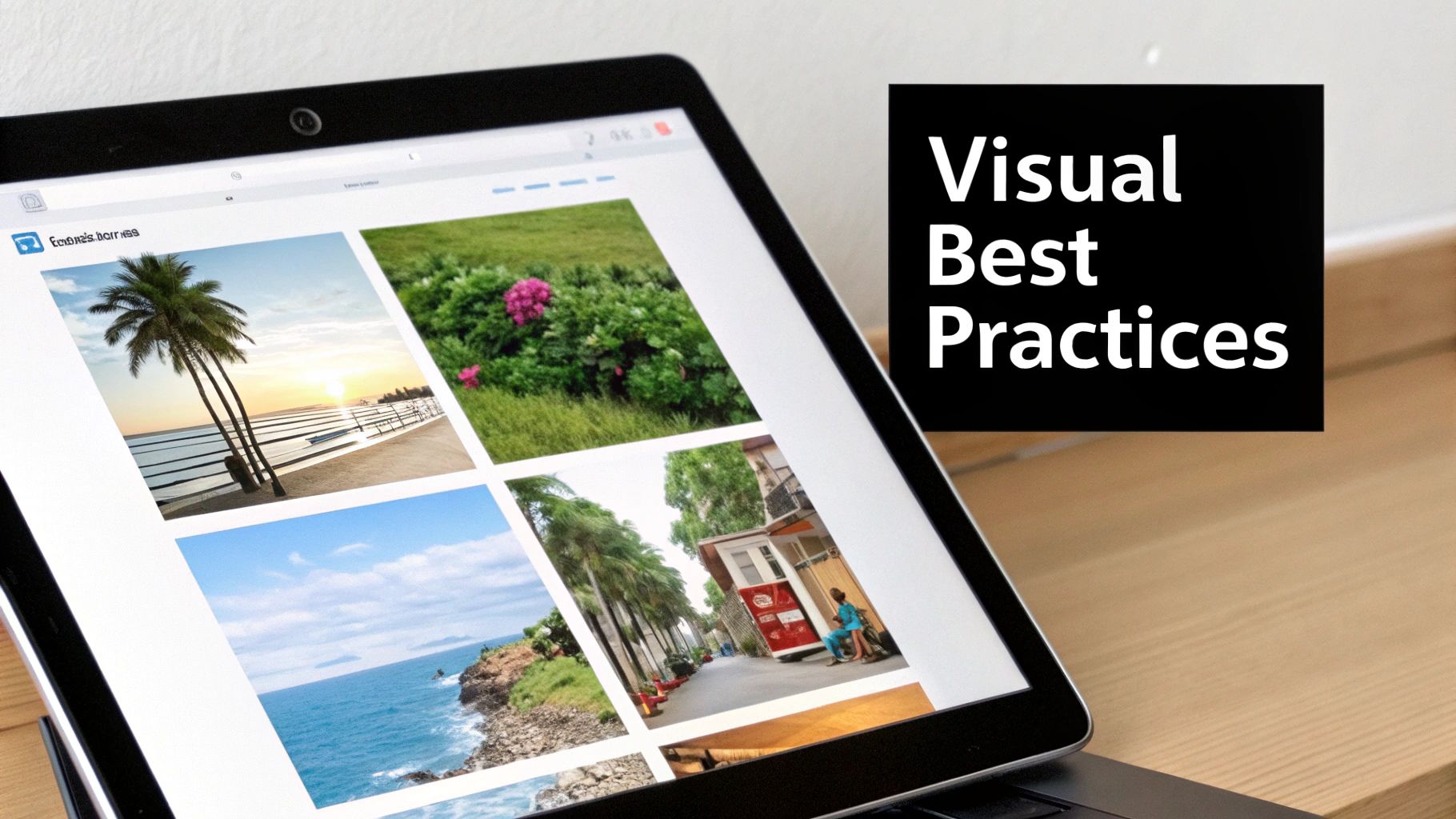
This chart gives you a great visual comparison of the three most common image types you'll work with on your personal profile and posts.
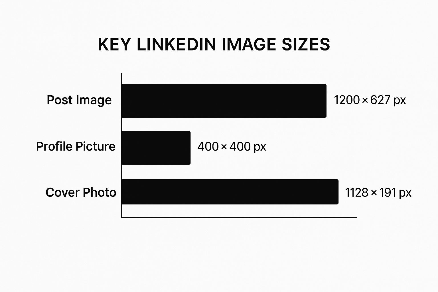
As you can see, the cover photo is extremely wide and short, which can be tricky to design for. In contrast, your profile and post images are much more balanced and compact.
Why Your LinkedIn Image Size Really Matters
Let's be honest, getting your LinkedIn image dimensions right feels like a tiny detail. But in a feed full of content, that tiny detail is a massive part of your professional first impression. The right size ensures your images look crisp, clean, and professional, which has a direct impact on how people see you and your message.
A perfectly sized image grabs attention for all the right reasons. On the flip side, one that's poorly sized can make you look sloppy before anyone even reads your post.
What Happens When You Get It Wrong?
We've all seen it: the pixelated logo, the blurry team photo, or the perfectly crafted graphic with the most important text bizarrely cropped out. These are the classic signs of incorrect image sizing, and they're especially glaring on mobile, where most people are scrolling through LinkedIn anyway.
An image that's stretched or cut off doesn't just look bad; it screams "I don't pay attention to detail." That's a subtle but damaging knock against your personal or company brand.
It's All About Performance
When your visuals are on point, your content performs better. It’s that simple. A sharp, well-composed image that fits the feed exactly as intended is far more likely to get the likes, comments, and shares you're looking for. It builds trust and reinforces that you're an authority in your space.
Think of it this way: when your visuals are polished, your message automatically feels more valuable. This small step can make a big difference in your click-through rates and overall engagement.
At the end of the day, paying attention to the correct LinkedIn post images size isn't just a technical task; it's a strategic move. It makes sure your content looks great and works hard for you, helping you stand out in a very crowded professional world. For more tips on making your posts more effective, check out our guide on adding links to a LinkedIn post.
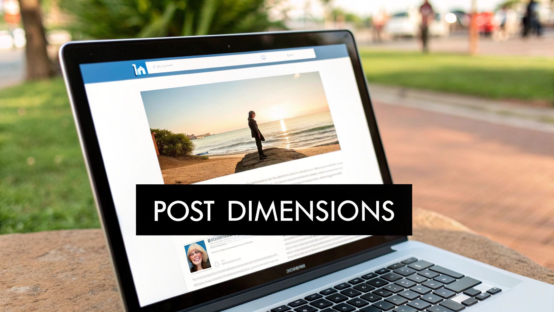
Getting Image Sizes Right for Standard LinkedIn Posts
When you create a standard post, you're using the most fundamental tool in your LinkedIn toolkit. The image you choose can make or break its performance, and a lot of that comes down to getting the size right. LinkedIn handles a few different orientations, but each one shines in different situations, especially when you think about how it'll look on a desktop versus a phone.
Nailing these details is what separates a post that gets noticed from one that gets scrolled past.
Over the years, LinkedIn has tweaked its guidelines to favor clear, engaging visuals. For a long time, the go-to recommendation for a landscape image was 1200 x 627 pixels. This creates a 1.91:1 aspect ratio, which is still a great choice if your post includes a link, as it perfectly matches the link preview format.
That said, things have shifted. Taller images are taking over because they perform so well on mobile. You’ll see a lot of success with square images at 1200 x 1200 pixels (a 1:1 ratio) and vertical (or portrait) images at 1080 x 1350 pixels (a 4:5 ratio). These formats simply take up more of the screen when someone is scrolling on their phone. For a deeper dive into how these sizes became the standard, check out some recent studies on LinkedIn post dimensions.
How to Pick the Best Orientation
So, which one should you use? It really depends on what you're posting and what you want to achieve. Here’s a simple way to think about it:
Landscape (1.91:1): This is your classic, safe bet. It works especially well for sharing links and for wide photos. It’s the standard for desktop viewing.
Square (1:1): A fantastic all-rounder. Square images look great on both desktop and mobile, offering a balanced frame that's perfect for infographics, quotes, or headshots.
Vertical (4:5): This is the winner for a mobile-first approach. Because it's taller, it dominates the screen on a phone, making your post much harder to ignore.
Here's the bottom line: always design for mobile. The vast majority of people are scrolling through LinkedIn on their phones. That's why a square or vertical image will almost always get you better engagement than a traditional landscape one.
No matter which orientation you choose, make sure your file size stays under 5MB. A good rule of thumb for file types is to use JPG for photos (it keeps the file size down) and PNG for graphics that have sharp lines, text, or logos (it preserves the quality). This way, your images load fast and look crisp.
Your Profile & Company Page Images
Think of your LinkedIn profile or company page as your professional storefront. The images you use are the first thing people notice, so getting them right is key to making a great first impression and building credibility. Each image has a specific job, whether it's your personal headshot or your company's branded banner.
Personal Profile Essentials
For your personal profile, a crisp, professional profile picture is a must. The ideal size here is 400 x 400 pixels.
Your background banner, that larger image at the top, gives you a great canvas to tell a visual story about your brand or career. For this, you’ll want to use an image that’s 1584 x 396 pixels.
Getting Company Page Visuals Right
Company pages have their own set of dimensions designed to keep branding consistent and professional across the platform.
- Company Logo: Aim for 300 x 300 pixels. This square format keeps your logo looking sharp everywhere it appears, from search results to your main page.
- Company Cover Image: The banner at the top of your company page needs to be 1128 x 191 pixels. This is prime real estate, perfect for showcasing your brand, highlighting an event, or giving a glimpse into your company culture.
It's worth the effort to get these dimensions just right. Profiles with properly optimized images see a huge bump in interaction—we're talking about 98% better engagement. It's a simple tweak that makes a big difference.
Of course, images are just one piece of the puzzle. For a complete picture, it's also helpful to know what to include on your LinkedIn profile to build a strong presence overall.
Getting Image Sizes Right for Articles, Events, and Videos
LinkedIn isn't just about standard posts. When you're sharing long-form articles, promoting an event, or uploading a video, the visual rules change. Each of these formats has its own specific image requirements designed to make your content look its best and grab attention.
Let's break down the exact dimensions you need for these important content types.
Dimensions for LinkedIn Articles and Events
The banner image is your first, and often only, chance to convince someone to click on your article or event. A sharp, well-designed visual makes all the difference.
- Article Hero Image: The ideal size here is 1200 x 644 pixels. This wide format gives you a great canvas to work with, perfect for a high-quality photo or a branded graphic that sets the stage for your writing.
- Event Banner Image: When you're promoting a webinar, conference, or a networking meetup, aim for 1776 x 444 pixels. This extra-wide ratio is tailored for event banners, giving you plenty of room for branding and key details.
Optimizing LinkedIn Video Thumbnails
Don't let LinkedIn choose a random, blurry frame from your video as the thumbnail. A custom thumbnail is your best bet for getting people to stop scrolling and actually hit play.
The simplest rule of thumb? Match your thumbnail's aspect ratio to your video's aspect ratio. This ensures a seamless look without any distracting black bars or weird cropping. It just looks more professional.
Here’s how that plays out for common video formats:
- Landscape (16:9): A standard 1920 x 1080 pixels thumbnail is perfect.
- Square (1:1): Go with 1080 x 1080 pixels.
- Vertical (9:16): Design your thumbnail at 1080 x 1920 pixels.
Taking the time to create custom visuals for these formats ensures a polished, professional look across everything you share on the platform.
Best Practices for Creating High-Quality LinkedIn Images
Getting the LinkedIn post image size right is a great start, but it's only half the battle. To really make your visuals pop and look professional, you need to nail a few key technical details.
First up, file formats. This is a simple but critical choice. For photos, stick with JPG to get a good balance of quality and a reasonable file size. But if you're working with graphics that have sharp lines, text, or transparent backgrounds, PNG is your best bet. It'll keep everything looking crisp and clean, avoiding that dreaded pixelation.
Design With Mobile in Mind
It's a mobile world, and most people are scrolling through their LinkedIn feed on their phones. This means you absolutely have to design for a smaller screen first.
Keep your most important information—like key text or the main focus of your image—smack in the center. This little trick ensures your core message doesn't get awkwardly cropped when viewed on a phone.
Here's a pro tip: Always compress your images before you upload them. Tools like TinyPNG or Squoosh are fantastic for shrinking file sizes without sacrificing noticeable quality. Faster-loading images mean a much better experience for your audience.
Pairing these technical tips with solid content is how you create visuals that stop the scroll. To learn how to match great images with equally powerful text, check out our guide on how to write engaging LinkedIn posts. And for a wider view, exploring broader content best practices can offer even more insight.
Frequently Asked Questions About LinkedIn Image Sizes
Even when you have all the right numbers, some questions about LinkedIn image sizes can still pop up. Here are some quick, straightforward answers to the most common issues people run into.
What Happens If My Image Is the Wrong Size?
If you upload an image that doesn't fit LinkedIn's recommended dimensions, the platform will try to fix it by automatically cropping or resizing it. Unfortunately, this often leads to blurry photos, text getting awkwardly chopped off, or key parts of your visual being completely hidden.
This is especially true on mobile. To keep control over how your content looks, starting with the right size is the only way to go.
What Is the Best Image Size for Mobile?
For the best results on mobile, you can't go wrong with a square (1:1 aspect ratio) or a vertical image (4:5 aspect ratio). These taller formats fill more of the screen on a phone, making your post much more eye-catching and harder for someone to just scroll right past.
While traditional landscape images still work, they just don't have the same visual punch on a mobile feed.
Can I Use One Image for Both Posts and Ads?
You technically can, but I wouldn't recommend it. The dimensions for regular organic posts and the various ad formats are often different. For example, a carousel ad needs a 1080 x 1080 pixel image, which might not be what you'd use for a standard post.
It's always a good idea to double-check the specific image requirements for your ad campaign to make sure it performs its best.
The most important takeaway here is to always preview your post on both desktop and mobile before you publish. Those few extra seconds of checking can save you from a visual blunder that could hurt your professional image.
For more tips on creating content that truly connects, check out our complete guide on LinkedIn post best practices.
Ready to create scroll-stopping LinkedIn content without all the guesswork? Let autoghostwriter help. Our AI-powered platform gives you proven templates and AI-generated images to build an engaging professional presence. Start creating high-quality posts today.